
The Psychology of Taste: How Food Packaging Shapes What We Crave
Ever notice how a snack looks delicious before you even open it? That’s not an accident.Before taste, smell, or texture, the first bite happens with our eyes.
Food packaging isn’t just a container; it’s a psychological experience wrapped in colour, typography, and texture. It tells us what to expect, what to feel, and even how much we’re willing to pay. At Altro Labels, we see packaging not just as a branding tool, but as a subconscious conversation between product and consumer.
Let’s unpack (pun intended) how that conversation works.
1. Color: The Flavor Before the Flavor
Colour psychology is the first ingredient in the emotional recipe.
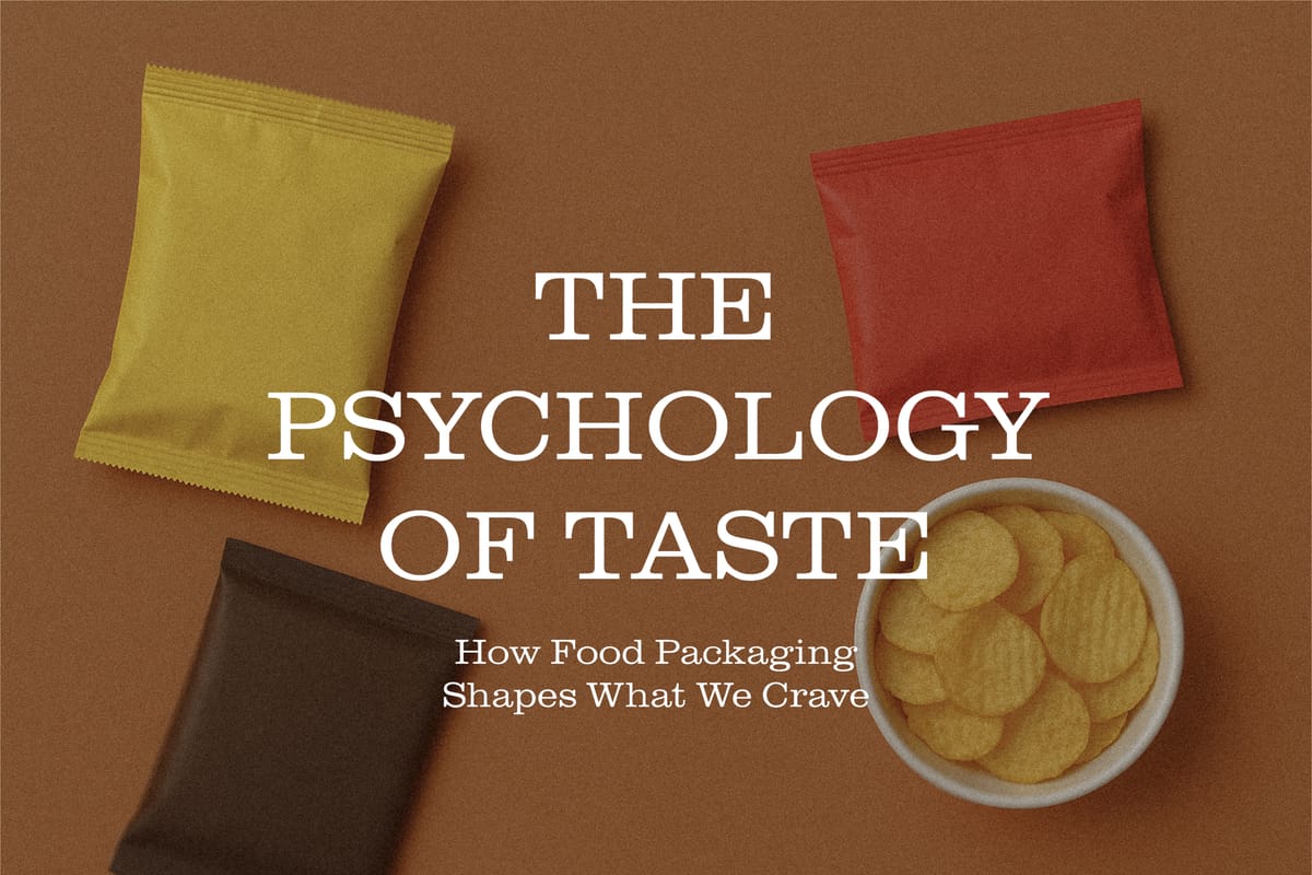
- Red and yellow trigger hunger and excitement, which is why fast food giants swear by them.
- Green whispers fresh, organic, healthy.
- Black and gold? They shout premium, indulgent, limited edition.
A single hue can alter perceived flavour, quality, and even how “filling” a food feels. In short, the right colour palette doesn’t just sell food, it creates appetite.
2. Typography: The Brand’s Voice
Fonts can taste sweet, salty, or even spicy, metaphorically speaking.
A handwritten script makes a product feel artisanal and crafted with care. A bold sans-serif says modern, clean, confident. The way words appear on packaging determines whether a consumer feels like they’re buying grandma’s secret recipe or a futuristic health snack designed by a nutritionist in a lab coat.
Good typography doesn’t just inform; it seduces.3. Material & Texture: The Feel Factor
Ever picked up a matte-finished chocolate bar and thought, this feels expensive?Texture adds another sensory layer that reinforces perceived value. Glossy finishes, soft-touch coatings, and embossed logos make the product feel real, tangible, and intentional.
In a world where so much is digital, physical texture becomes a silent language of trust and authenticity.
4. Imagery: The Power of Suggestion
Mouthwatering visuals activate the brain’s taste and reward centers. Even a subtle drizzle of honey or a crisp lettuce leaf on packaging can stimulate cravings.
But imagery goes deeper; it tells stories. A rustic photo might evoke nostalgia and comfort, while a minimalist design might trigger health and control.
It’s less about showing the food and more about showing the feeling behind it.
5. Transparency: Literally and Figuratively
Today’s consumers crave honesty in ingredients and design.
Transparent windows, minimal labelling, and “clean” visuals communicate integrity. They say: We have nothing to hide.
And it works. Studies show that packaging perceived as “authentic” boosts both purchase intent and brand loyalty.
6. Consistency: Building the Subconscious Connection
Over time, consistent packaging builds brand memory. When consumers recognize your colour, font, or shape instantly, that’s not a coincidence; it’s cognitive conditioning.
The human brain loves patterns. Consistent design turns packaging into a mental shortcut at a glance, and they already trust what’s inside.
At Altro, we believe packaging design is more than aesthetics; it’s an act of empathy. Understanding how consumers think, feel, and choose transforms a label into a story that resonates beyond the shelf.
Because when packaging connects on a psychological level, it doesn’t just hold food, it holds meaning. [Contact us here.]