Top Label and Packaging Design Trends
Nowadays, customers are becoming extremely aware of their purchasing decisions. If you're still using traditional methods to win their hearts, your business might become a tale of the past.
You need to follow the latest trends and adopt them in your business.
One such trend is product labeling and packaging designs. Yes, it's not an innovation. But it can attract your target audience. Your product will stand out if you have an eye-catching label design or packaging.
You must innovate your labels and packaging to make your brand memorable and leave a long-lasting impact on your customers' hearts. How is that possible?
By staying updated with the latest trends and evolving with them. If you also want to grab your audience's attention, this blog will be a wealth of information for you because we'll share the best labeling and packaging design trends that will transform your business.
So, are you ready to level up the aesthetic appeal of your products? Let's dive in.
7 Best Labeling And Packaging Trends
You can't just wrap your product with gift paper and send it to your customers. It might have worked 10-20 years ago, but not anymore. Now, you have to be quick, creative, and unique.
How can you do that?
By knowing what others are doing and the latest trends. Here, you'll learn about the seven latest trends in labels and packaging to elevate your designs.
1. Use Custom Typography To Stand Out
Source: Pexels
Everybody wants to make their business unique and stand out. But is there any way to do it?
Yes. It is using customizing your brand appearance. Don't copy-paste it from your competitors because what's working for them might not work for you.
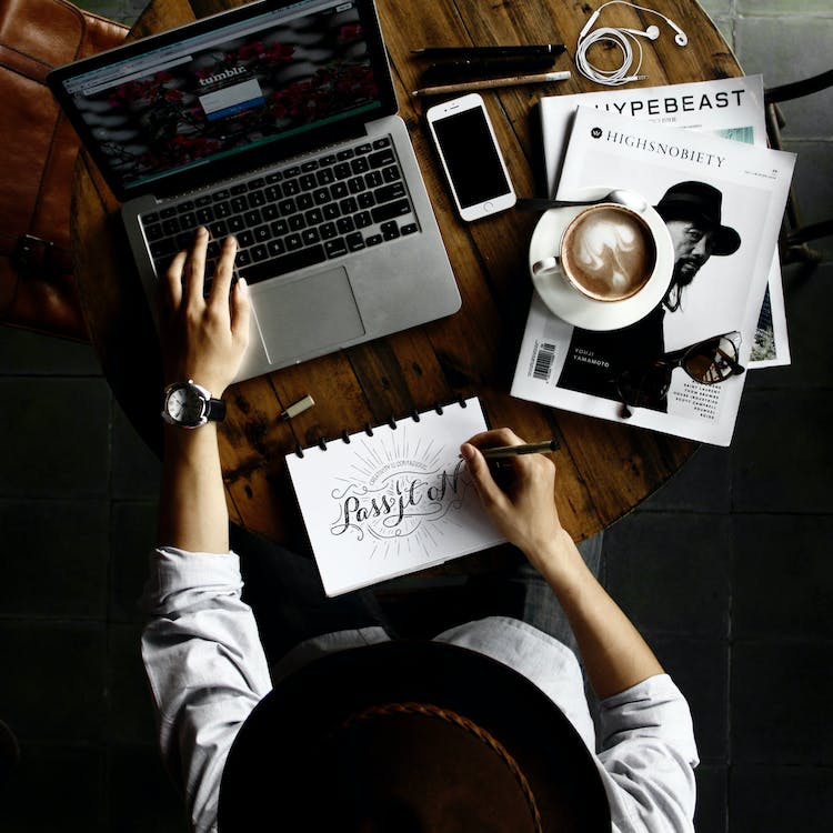
Start by making custom typography. Use unique letters and typography. Do you know how it can benefit you?
It'll make your brand easily recognizable among a pool of competitors. You can even use handwritten fonts to connect with your audience emotionally.
That way, you are working on your product branding and providing memorable experiences to the customers. It has a positive, long-lasting impression on customers.
There are different technologies available today through which you can create the best lettering typography for your designs. It's not only about telling people the name of your company. It's about communicating and engaging with them.
2. Minimalistic Designs With Vintage Aesthetic
Do you think retro and vintage designs are old-fashioned?
Many people think this way, but in 2023, trends are shifting. You might even see designs of the past emerging once again. Designs that are minimal with a clean look.
Do you remember pixelated graphics and technicolor patterns? They were extremely popular in the 80s and 90s. They were considered perfect to spark curiosity in their target audience.
One perfect example of this is Coca-Cola.
They often release special edition bottles and cans featuring retro designs. These design elements showcase the brand's iconic logos and slogans from different eras. It creates a sense of nostalgia and collectibility.
This trend is also coming back, and many businesses are implementing it. Why is this happening?
To make people feel nostalgic. You'll notice that all these spark a feeling in the customers. It can be:
- Curiosity
- Nostalgia
- Happiness
- Excitement
You've to ensure your brand is also doing something similar. Your packaging or label should make people feel certain emotions. That's how you connect with customers and build meaningful, long-term relations.
3. Rich Color Palette Which Grabs Attention
Source: Pexels
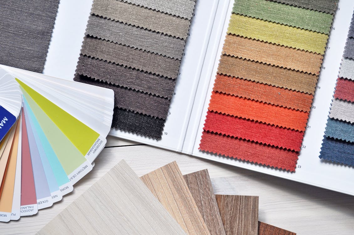
Another trend in designs is using different colors that weren't common earlier. Some of these are neons and neutrals. People are running entire businesses, making these colors their USP.
People want variety, and they love bold and natural colors. Neons and neutrals were common in the first two decades of millennials. They provide a basis for creating richer jewel tones.
But there's something you should know. Don't use excessively bright colours to jump on the trend. Here are some more tips you should remember while choosing a color palette for your packaging or labels.
- Avoid color combinations that clash or create visual discomfort.
- Colors that are extremely dark or light can be difficult to read or may not reproduce well in print or on digital screens. Extreme blacks or whites can sometimes be too harsh.
- Ensure that your chosen colors align with your brand's message and values. For instance, using gloomy, dark colors for a wellness or happiness-focused brand would not convey the right message.
Neons are attention-grabbing; meanwhile, neutrals give a calming sense of relief. In 2023, jewel tones are expected to dominate. The formula is simple.
Choose a color = Elegant + Creative.
4. Add Luxury By Using Foils
Customers want to buy your product because they want a solution to their problem. At the same time, you can make them feel like a luxury.
That's why you chose a color palette, right?
But you can go one step ahead by using foil printing for labels and packaging. They have a unique texture, which adds luxury to your print materials.
But there is not only one way to use foil for your business needs. You can be creative with it and create customized labels.
At Altro Labels, we ensure that your custom label does not look like 100 other companies. We follow a unique and personalized approach. So, think about how to make the trend work for you in the best possible way. It should help your brand outshine the competition with an elegant look.
5. Gradient Packaging Design Trends in 2023
Gradients are becoming popular in labels and almost every sort of graphic design.
They give a modern and contemporary feel to the packaging. As of now, many tech-savvy and forward-thinking brands are using it. It makes them a popular choice for products targeting younger demographics.
Versatility makes gradient a good choice for many designs if you want to make a specific part of your design prominent and make it pop.
Then, the gradient will be a game-changer. It's an amazing way to showcase creativity and establish a unique brand identity. Gradients can symbolize transitions or tell a story.
For example, a beverage product label might use a gradient to show the shift from day to night. Thus highlighting the product's versatility.
6. Use The Power Of Artificial Intelligence

Source: Ideogram
Artificial Intelligence has revolutionized every industry. From chatGPT to Bard, many tools assist in content creation tasks within minutes.
But how is this trend changing the packaging and labels sector?
Here's how.
People usually think that smart packaging is amazing, which could only be done if you have a team of tech enthusiasts.
But not anymore.
There's a remarkable shift that allows everyone to use this technology. Two things are extremely crucial in it.
- Augmented reality
- Mixed reality
The packaging and label sector adoption was comparatively low because of cost and complexity. But still, many companies are using AI in designs. Do you know how?
Through AI tools and software. There are many tools like Ideogram, Mid Journey, and Blue Willow from which you can get inspiration.
Leveraging AI software in the design process involves collaborating with designers and design teams. It's to bridge the gap between productivity and creativity. This integration also addresses the emotional and human touch that can sometimes be overlooked.
Moreover, the year saw a growing interest in simplifying personalization, customization, and the implementation of "smart packaging."
What is smart packaging?
Smart packaging refers to packaging that has advanced technologies and features. It enhances the functionality, safety, and consumer experience of a product.
It goes beyond the traditional packaging role, primarily for containment and protection.
7. Add Meaning Through Artworks
Drawings and paintings have always been a way of communication with customers. But there's another addition to this, which is doodles.
But why are they popular? Why are brands using it?
Because these are powerful tools for storytelling, they can convey the brand's message, values, and product benefits in a visually compelling way.
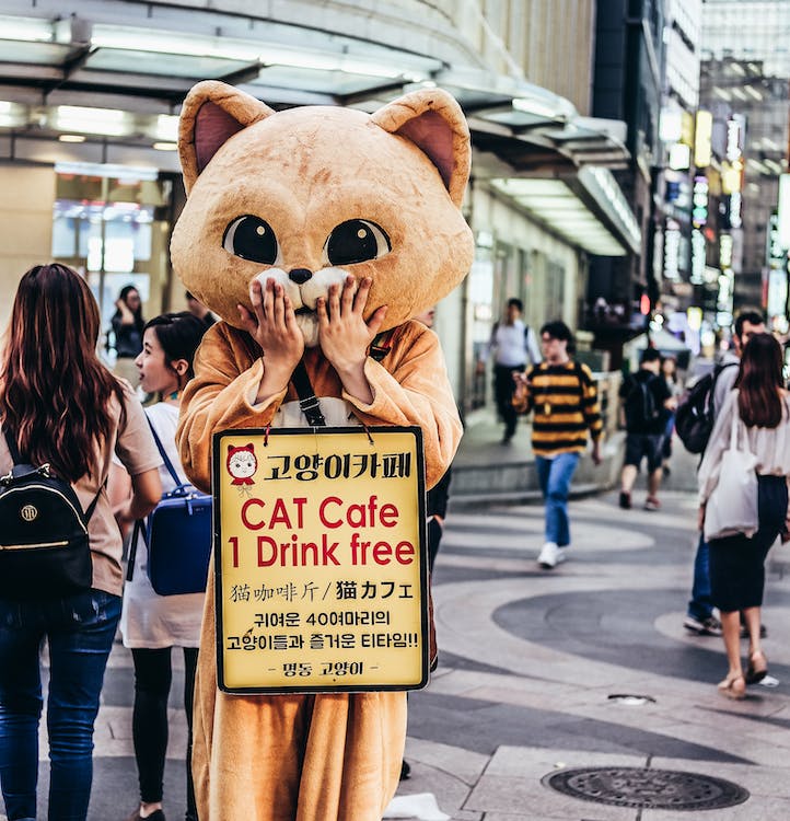
Local and international brands are using it to influence their customers. There's another popular trend, which is mascot characters.
Source: Pexels
One of the best examples of this is the Duolingo mascot. You'll see it printed on their labels, packaging, online platforms, and everywhere.
But it doesn't have to be a fantasy character or animal. It can be a real human, a flower, or a cartoon charm. It can attract the attention of potential customers.
These are all forms of artwork that companies use.
Another trend in package design that you should know about is the increase in sustainable packaging. Adopting eco-friendly packaging designs is the future. It reduces carbon footprint, and it can attract eco-conscious customers.
Conclusion
Have you ever counted how many people are doing the business in the same niche? Selling the same product.
The question is not how many brands are there. The big question is how many brands stay in the minds of customers.
Customers are bombarded with plenty of choices. Every industry has a lot of noise; labels and packaging design aesthetics are game-changers for businesses.
With it, you will gain the audience's attention and impact their purchasing decisions. To stay above your competitors, you can't afford to pay no heed to these trends. Because it can be equivalent to your competitors getting more sales, conversions, and improved brand image.
So, implement this process wisely. Keeping up with the trends and changes can be quite difficult. You must be open to all the designs but don't jump into them immediately.
Instead, brainstorm and shortlist trends that align with your business values and goals. That's how you can strengthen your position even in a saturated market.
