Unveiling the Power of Cosmetic Labels
Cosmetic labels play a crucial role in the beauty industry, providing essential information about the products we use on our bodies every day. As consumers become more conscious about the ingredients they apply to their skin, the demand for custom cosmetic labels has soared. In this blog, we will explore the fascinating world of cosmetic labels, including their importance, customization options, and how they enhance brand recognition. So, let's dive in and unravel the secrets behind these tiny yet influential product identifiers.
Understanding Cosmetic Labels: A Closer Look at the Basics
Cosmetic labels serve as a bridge between consumers and the products they purchase. These labels include vital details such as product name, ingredients, directions for use, warnings, and much more. We will delve into each element to shed light on their significance, helping consumers make informed decisions about the beauty products they choose.
Custom Cosmetic Labels: Tailoring Beauty to Perfection
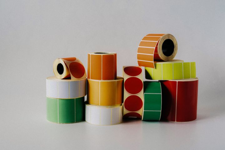
In a world where personalization is key, custom cosmetic labels have emerged as a popular trend. Businesses and independent cosmetic creators are now leveraging the power of customized labels to differentiate their products and captivate their target audience. We will explore the various options available for creating custom cosmetic labels, including design choices, materials, finishes, and printing techniques.
The Impact of Custom Cosmetic Labels
Brand Identity and Differentiation
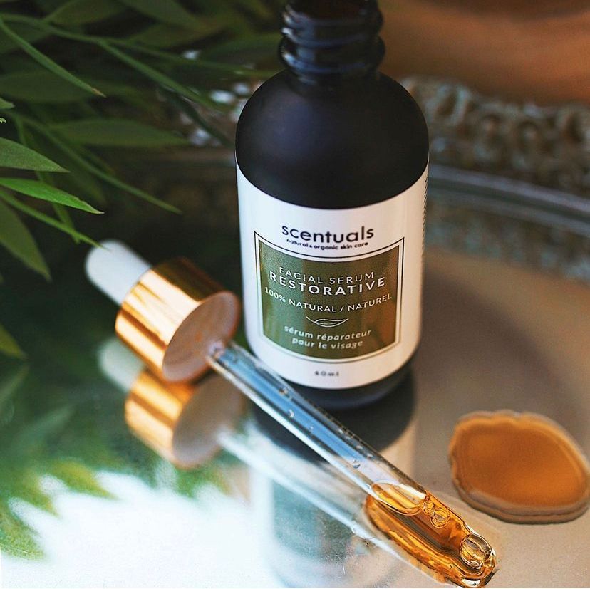
Custom cosmetic labels allow brands to establish a unique identity and stand out in a crowded market. By incorporating distinctive design elements, such as logos, color schemes, and fonts, labels become recognizable and create a lasting impression. They serve as a visual representation of the brand's personality, values, and quality, making it easier for consumers to identify and connect with their preferred products.
Enhanced Product Presentation
First impressions matter, and custom cosmetic labels contribute significantly to the visual appeal of products. Eye-catching designs, captivating imagery, and thoughtful layouts attract attention on crowded shelves, online marketplaces, and social media platforms. The incorporation of premium materials and finishes further enhances the overall product presentation, lending an air of luxury and sophistication.
Compliance and Legal Requirements
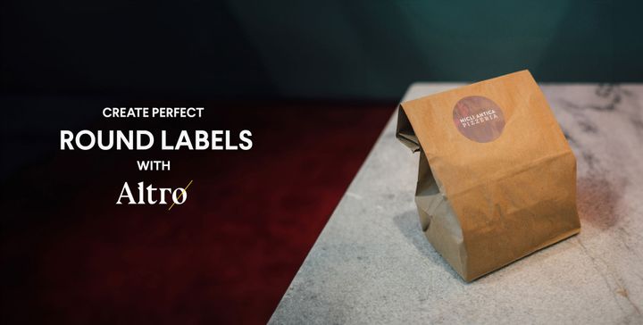
Cosmetic labels must comply with strict regulations to ensure consumer safety and maintain industry standards. Customization allows brands to meet these requirements while still incorporating their unique branding elements. By working closely with Altro Labels who specialize in cosmetic labeling, brands can ensure that their labels adhere to all necessary legal guidelines while maintaining aesthetic appeal.
Choosing the Right Printing Partner: Ensuring Quality and Compliance
When it comes to cosmetic labels, quality and compliance are non-negotiable. We will guide you through the process of selecting the right printing partner for your custom cosmetic labels. Learn about certifications, industry standards, and printing technologies that ensure your labels meet regulatory requirements and maintain exceptional quality throughout the manufacturing process.
Custom Cosmetic Labels for Small Businesses: Leveling the Playing Field
Launching a cosmetic brand as a small business can be challenging, but custom labels offer a unique opportunity to compete with established industry players. We will explore cost-effective strategies for small businesses to create eye-catching custom cosmetic labels that align with their brand identity. Discover how to make an impact on a limited budget and establish a strong presence in the beauty market.
Conclusion
Cosmetic labels are not just adhesive stickers on a product; they are powerful tools that communicate a brand's values, ingredients, and usage instructions. Custom cosmetic labels take this communication to the next level, allowing brands to stand out and connect with their target audience in a meaningful way. By understanding the basics, embracing customization options, and prioritizing quality and compliance, cosmetic businesses can unlock the true potential of their products and create lasting brand impressions. Invest in custom cosmetic labels and witness the transformative power they have on your brand's success.
Get everyone’s attention on your products with the latest technology and highest quality materials. Tell us about your project today!