
Common Product Label Mistakes
There's so much noise about product labels. You should create labels using this method; XYZ technology is best, and so on.
But despite this, companies often make grave mistakes in their product labels. If these errors are ignored, you might have to deal with issues such as misbranding, customer confusion, and even product recalls. It ultimately impacts brand loyalty and customer trust.
But don't worry—mistakes are bound to happen. This guide will share some of the most common product label mistakes. You'll also learn effective methods for avoiding these mistakes.
So keep reading.
Quick Answer: The most common mistakes are poor color consistency and skipping basic legal requirements by the FDA, which can lead to legal issues. Remember to choose the right font, attention-grabbing images, and barcodes on the label.
7 Common Product Label Mistakes + Fixes
The product label process is crucial and time-consuming. But what if the result of product labels turns out to be terrible? What should you do?
It's best to be aware of these common product label mistakes in advance. Here are some of them, plus quick fixes that you can implement.
Terrible Colour Consistency
You've ordered hundreds, thousands, or maybe even more labels to print. You tell the company all the details and wait patiently. Then you receive a call that all the labels have been delivered. But when you open the labels, they are a complete disaster. Why?
Because there's no color consistency, the brand colors aren't on the label, and the shades are completely different. This is one of the most common mistakes.
Brand colors make you more identifiable in the market.
Big brands understand this, and that's why they never compromise on this aspect. For example, Cadbury's signature purple and Pepsi's blue, red, and white have helped customers develop recognition for these brands.
However, accomplishing the same color across all labels and products is not easy. Moreover, the color of the packaging material and computer screen look different. It's due to several factors, such as poor color configuration on the designer's monitor, incorrectly calibrated printers, or printing substances that may distort the color.
Tips To Avoid This Mistake
If you want to avoid this common issue, you should configure your printer using CMYK color configuration. This will give you results that are nearly closest to the actual label. Check the printer's hardware and make sure it's updated regularly.
Using color calibration tools ensures your screen's consistency. For maximum accuracy, use a spectrophotometer and evaluate the label color on the monitor. Use color extractors to detect CMYK and Pantone colors in the files.
Poor Barcode Placing
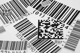
Source: waspbarcode
With technological advancement, businesses are updating their labels and adding barcodes. This is a great way to tell your customers more about your products, but many common mistakes turn this advancement into a nightmare.
Barcode errors can cause hefty fines, chargebacks, and a negative impact on your business. Misprints and poor material usage in barcodes are often noticed.
Tips To Avoid This Mistake
Fortunately, there are several ways to fix this error. It's best to save the barcode in the proper vector format, EMS. EPS. But why should you do that?
It removes any spots, shadows, or elements not supposed to be on the barcode.
Misprinting usually happens because of the printer's fast speed. You should turn off the printer and clean it properly. Now, turn it on and keep the pace slow. Here are some barcode measurements you should know.
- For printing, follow the recommended UPC or EAN size (1.469″ x 1.02″)
- Increase it to a maximum of 2.938″ x 2.04″
- Reduce it to a minimum of 1.175″ x 0.816″
Not Functioning Properly
From a design point of view, your label may look exceptionally great, but it fails to hold up really well. It might fail due to water, color fading in the sun, or scratches during shipping. Customers don't want to be stuck with boxes of faulty labels.
The situation arises because of the poor material used in the printing. However, the biggest cause is poor communication with your label printer company.
Tips To Avoid This Mistake
Some material defects came to be reversed. You can detect this defect before the label enters customers' hands. Choose the right labeling company for your label needs. Instead of doing it yourself, outsource to experts, which will save a lot of time and eliminate chances of mistakes. Provide them with detailed information about the product label, including your label's application and the product's use case.
- Will customers refrigerate products?
- Is it packed with other products?
- Best for usage indoors or outdoors?
- How long is it shipped?
- Heat exposure?
Clarify these aspects. You don't usually have to answer these questions, but providing this information makes the process easier.
Problems In Application
This is one of the most common mistakes, which frustrates many business owners. In this labeling mistake, the unwind direction of the label is wrong. The labels are coming off the roll in the wrong way, or the rolls you're using might be the wrong size.
But why is this crucial detail overlooked?
It's because the main focus is great artwork. The artwork should look good and attract customers, but functionality is heavily compromised in that race.
Tips To Avoid This Mistake
Both printer and packager play a primary role in this issue. Before initiating the project, visualize the entire labeling process. This will give the labeling company a clear idea of what labels you expect.
If you're using your own equipment, be clear about the size of rolls your requirement can easily manage. Generally, semi-automatic machines can only handle an 8" outside roll diameter.
But if you're working with a co-packer, ensure that they have a detailed guideline on the specifications of the product labels. It may seem time-consuming, but it will save you from the hassle that might be caused by this mistake.
Ignoring Basic Legal Requirements
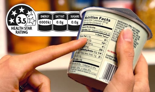
Source: lgbusinesssystems
Every business must comply with the rules and regulations of their state. Right? So the question is: is your product following those rules?
If yes. Then how can you tell customers about it?
That's why the FDA has created specific rules and regulations that every product company across the United States must follow. Some of these include
- Statement of identity
- Address of manufacturer
- Complete nutritional facts
- List of ingredients
- Net quantity
- Proper warning statements
If you don't want to face product recalls, always include these important things on the labels. You can find out more about FDA requirements here.
Tips To Avoid This Mistake
Several FDA requirements can be confusing. That's why it's best to create a checklist of FDA requirements. Assign a team to thoroughly check labels' compliance with these rules. You can also use online label management software to streamline the process.
Boring Pixelated Images
Use eye-catching images to attract customers' attention. This is true for every industry: Images can push customers to purchase the product.
But what if the images used are not attractive?
Even worse, your label images are grainy, pixelated, and blurry, which will directly impact your sales and brand positioning.
Tips To Avoid This Mistake
There are several reasons for this, so pinpointing one will be difficult. However, print and file errors are the most common reason behind poor product label images. They can happen due to two reasons: faulty printer plates or a file that wasn't saved in the proper format.
When an image is stretched out beyond resolution, it becomes blurry. If possible, use vector images, as they maintain crisp resolution. Thus, the chances of a pixelated image are less.
- 300 dpi → decent image
- 600 dpi → crisp and clean image
Always choose an image that translates your product. It should nudge the customer to buy your product.
Can't Read Font
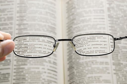
Source: caledonoptometry
According to statistics, almost 80% of US adults check the nutrition panel on the label, which impacts their buying decisions. But what if your product label is unreadable because of the font?
Then, customers will not purchase your product. This usually happens because businesses ignore FDA labeling requirements.
Tips To Avoid This Mistake
In retail, there are thousands and even more products, and checking each one's readability seems like an impossible task. But you can take preventive measures from the beginning to reduce these mistakes.
Visit the FDA website and read the FDA's code of regulations. Find the right font size for your product. Don't ignore the font color and contrast of the background. Remove obscuring graphics or elements that negatively affect readability. With the help of online tools, you can find the right font for your product.
Check out our detailed guide on font and color psychology to better understand how they impact product labels.
Wrapping Up
Labels are highly scrutinized, so the chances of mistakes are slim but not zero. A few errors might slip through the cracks, causing a lot of issues. So, working with a reputable labeling company with years of experience is best.
Altro Labels has a team of experts who are responsible for creating unique labels. Are you ready to attract more customers through unique and creative labels?
Contact us today.
Want to know more about how to level up your labels?
Check out our premium guides written by experts here.
Frequently Asked Questions
What Are The Defects Of Labels?
Label defects may vary depending on their quality and intended use. However, most users have reported tearing, wrinkling, air bubbles, skewing, etc. These issues are often due to the use of poor materials.
What Are Negative Labels?
Negative Labels refer to the terms or symbols used to criticize, demean, or stigmatize individuals, groups, behaviors, or ideas. These labels are based on stereotypes, racism, and negative perceptions of people. They leave immense social, physical, and emotional impact on the customers. Some of the common examples include fat, loser, poor, ugly, stupid, etc.